
Client Overview
Client Overview
The Public Philosophy Journal (PPJ) is a new open-access journal with the goals of transforming the peer review process and fostering dialogue about socially-relevant philosophical issues. In 2020, PPJ received a Mellon Foundation grant to develop their web presence. In 2021, they contracted the MSU iOS Design Lab to both redesign their WordPress website and help them with enhancing their web presence.
Project Overview
Project Overview
As a UX Designer in the iOS Lab, I was assigned to work on the Public Philosophy Journal as an expert in the design process and a Web Developer for the new iteration of the site.
My role: UX Designer and Web Developer. Research assistant.
Team: One researcher and myself.
The Process
The Process
Where do we begin?:
After meeting with the advisory board members who founded PPJ, our team developed a quick list of goals and expectations we sought to answer with a website redesign, mostly focused on engagement and brand presence.
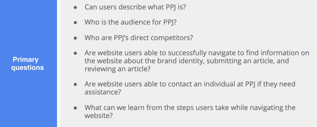
Scoping What Already Exists:
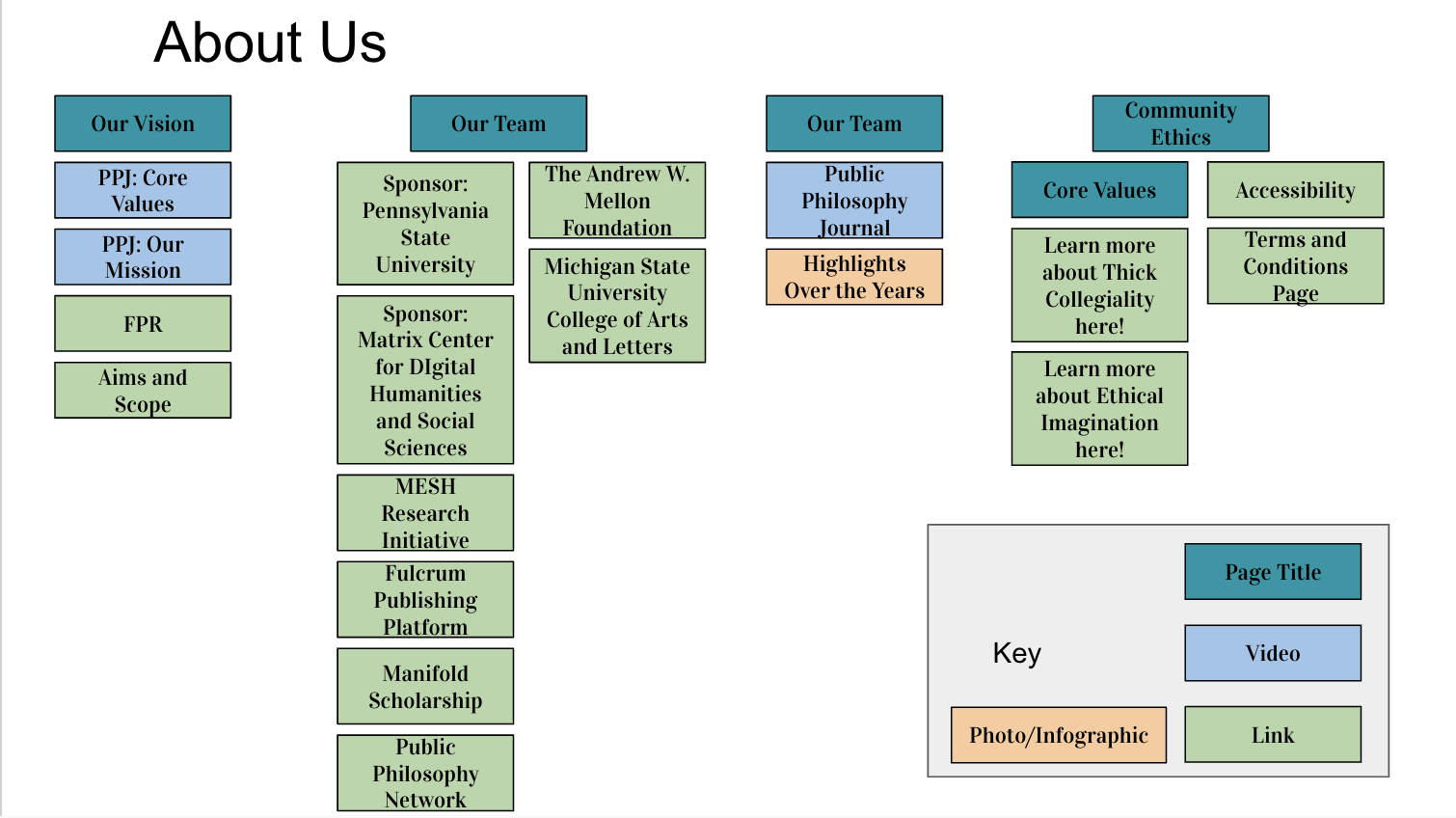
With a focus on web presence, it first became important to understand the current interaction the general public had with the journal. To scope this, I did a content audit of the entirety of PPJ’s website. I then took this data to the research team to help our R&D later on.
Identifying our User:
We then conducted interviews with the current administration of the PPJ team. These interviews got us connected with the heart and ambition of the journal, helping us to identify an ideal user base into three main categories:
- Writers for the journal
- Reviewers for the journal
- The general public
User Testing:
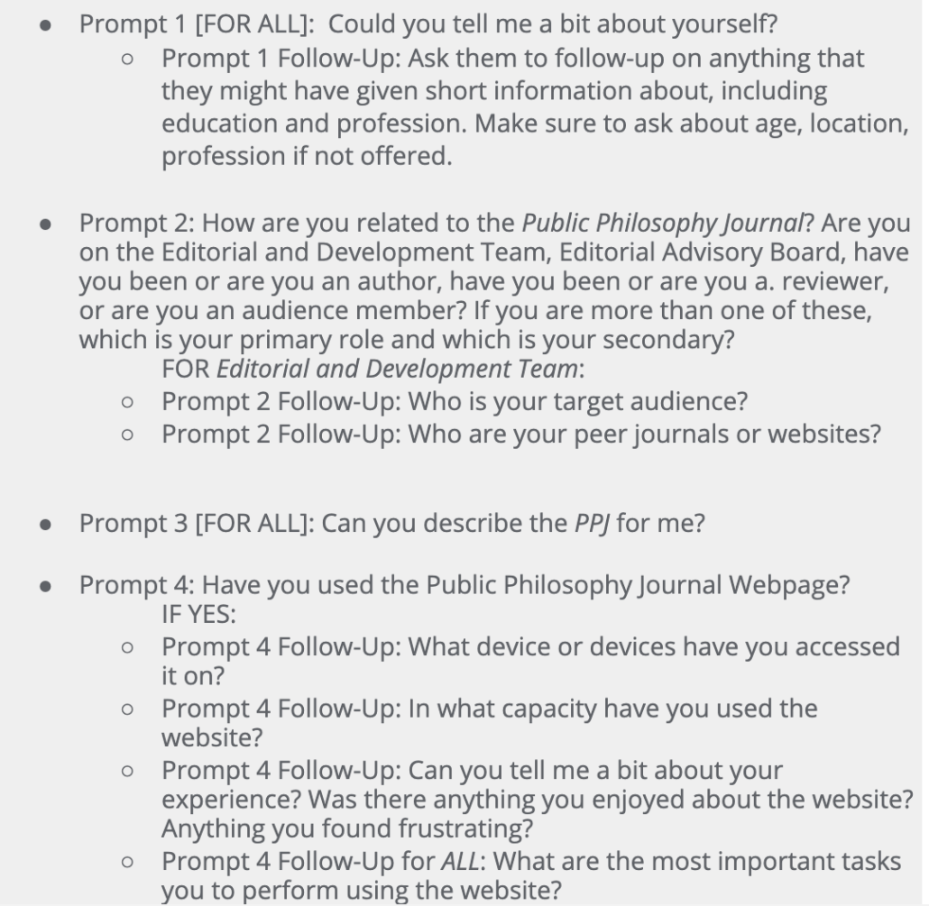
After collecting information about the current state of the website, we began user testing with volunteers from each group we had identified; writers, reviewers, and the public. Each group had questions tailored to the usability of the website and interaction level of the participants. This data was collected as a series of audio recordings in Otter.io. This allowed one of us to facilitate the interview while the other recorded and kept notes.
Developing Questions:
Our questions during testing were very specific to each user based on their roles and expectations for how the website operates. For example, those on the editorial and development team were asked about their purpose and audience when referencing particular materials on the homepage.
Finding the Issues:
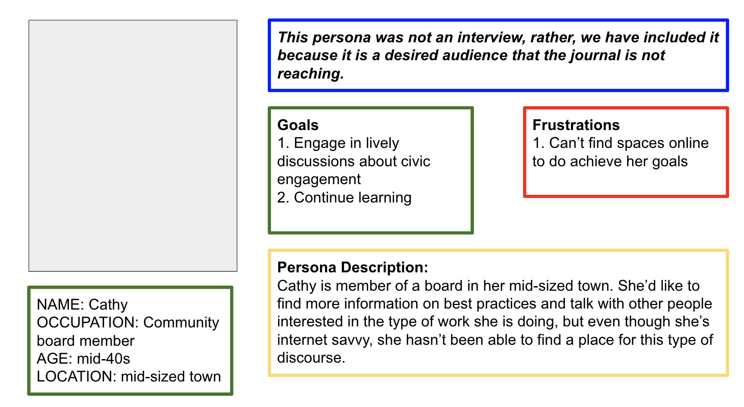
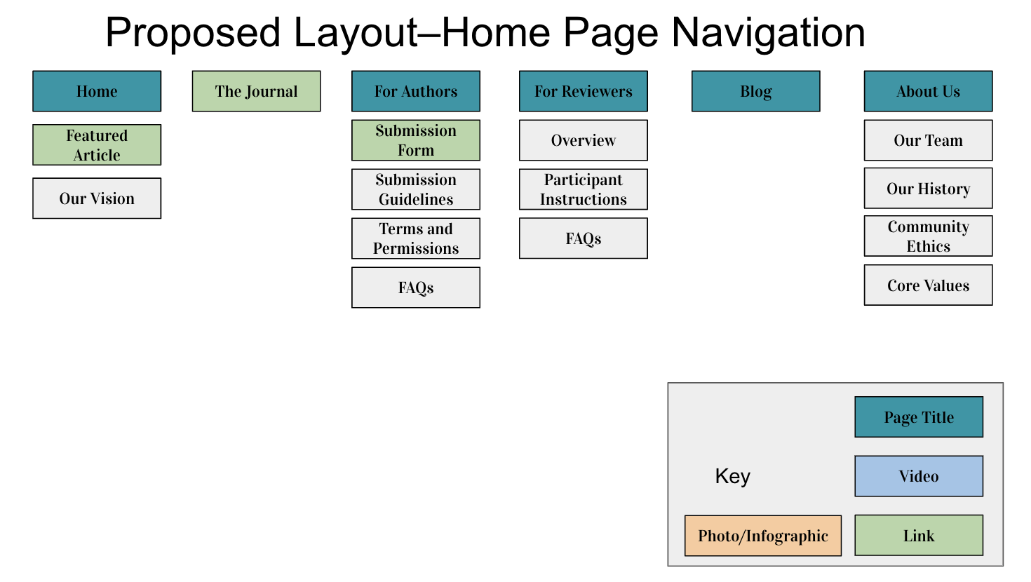
Once we compiled our user data, we began to identify key pain points in each user’s experience through the development of personas. Overwhelmingly, we identified that content was too hard to find. Most content was nested in unexpected lists or listed multiple times with different answers. With this in mind, we began work to redesign the website.
Restructuring from the Top:
To begin, we focused on the main navigation on the homepage. In an effort to simplify each identified user’s experience, we separated key information by user category. “For Researchers” and “For Reviewers” became new categories under our redesign.
Requesting Content:
Working alongside our administrative partners, we requested key content changes that came as a result of our user testing. Once information was updated, we worked to reframe and simplify the pages that existed within the PPJ system.
Proposing a Rebrand:
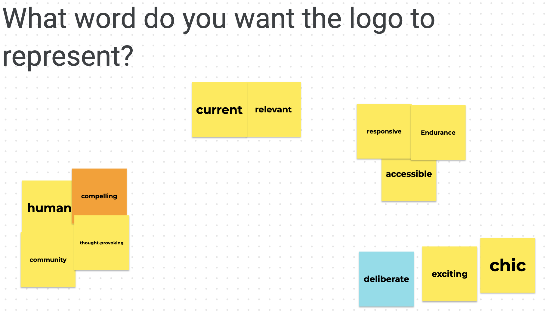
After undergoing massive changes in the PPJ website, we proposed a rebranding to the team to better match the identity they had illustrated to us in the early stages of our work. This was met with mixed criticism from PPJ staff, and a design sprint was facilitated by myself in an effort to make the issues we saw with the current branding tangible. We asked leading members of the PPJ to identify what the logo should represent. We determined, based on user feedback shown below, that the logo should be philosophical and promote the idea of collaboration that the journal was founded upon.

Moving Forward:
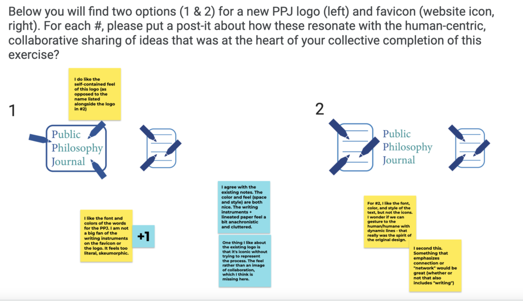
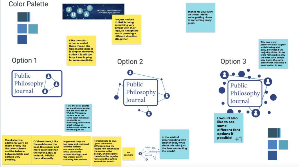
Presenting a variety of logos that captured the public engagement and peer review process of the journal, the advisory team chose to stick with their original logo.
Gaining Haptics:
To better measure the interaction that we had set out to increase, I installed google analytics on the site to start creating a general model of user-flow to the site. To help read these measurements, I created an instructional how-to sheet to help future staff and interns maintain this functionality.
Deliverables
Deliverables
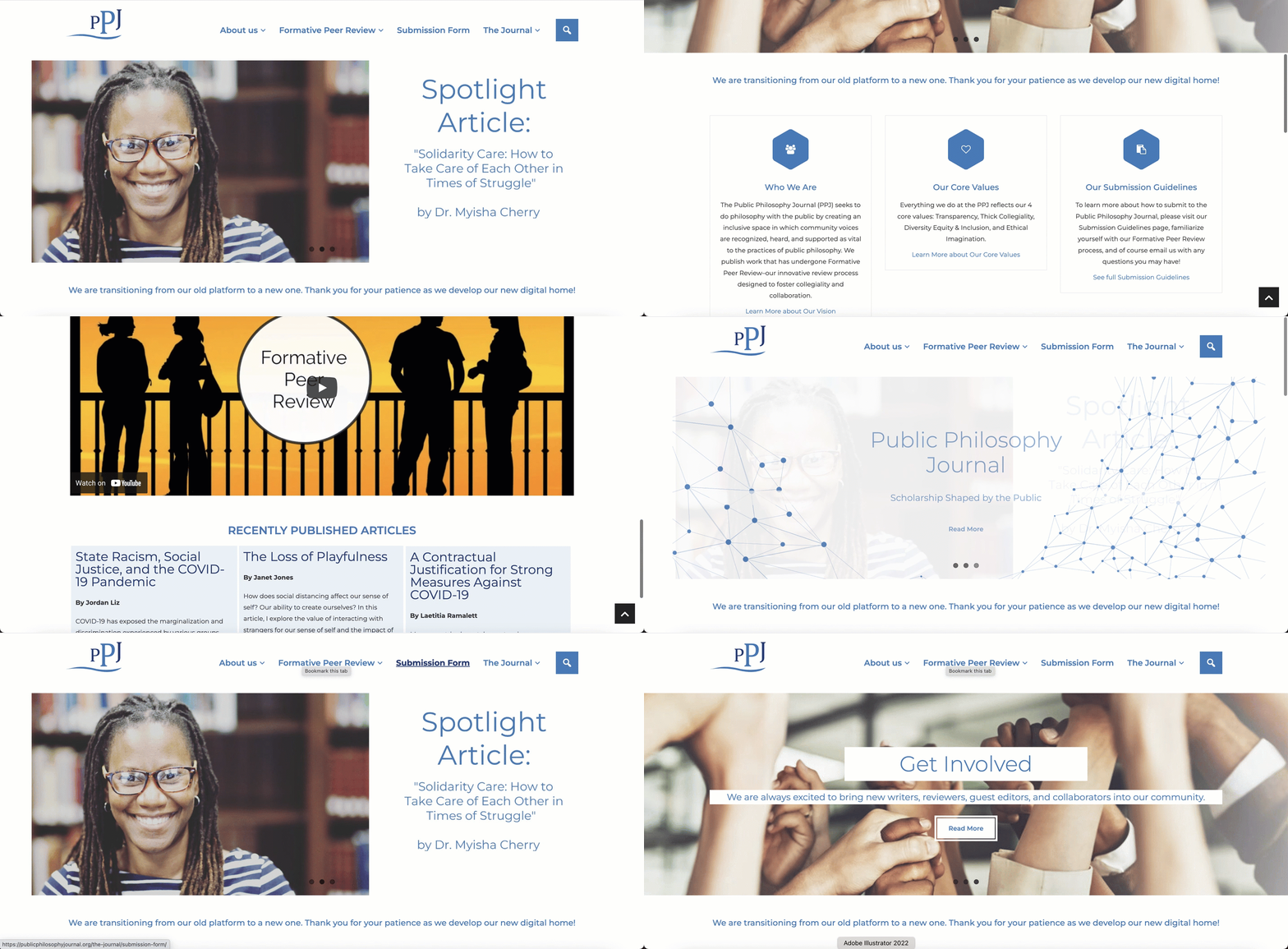
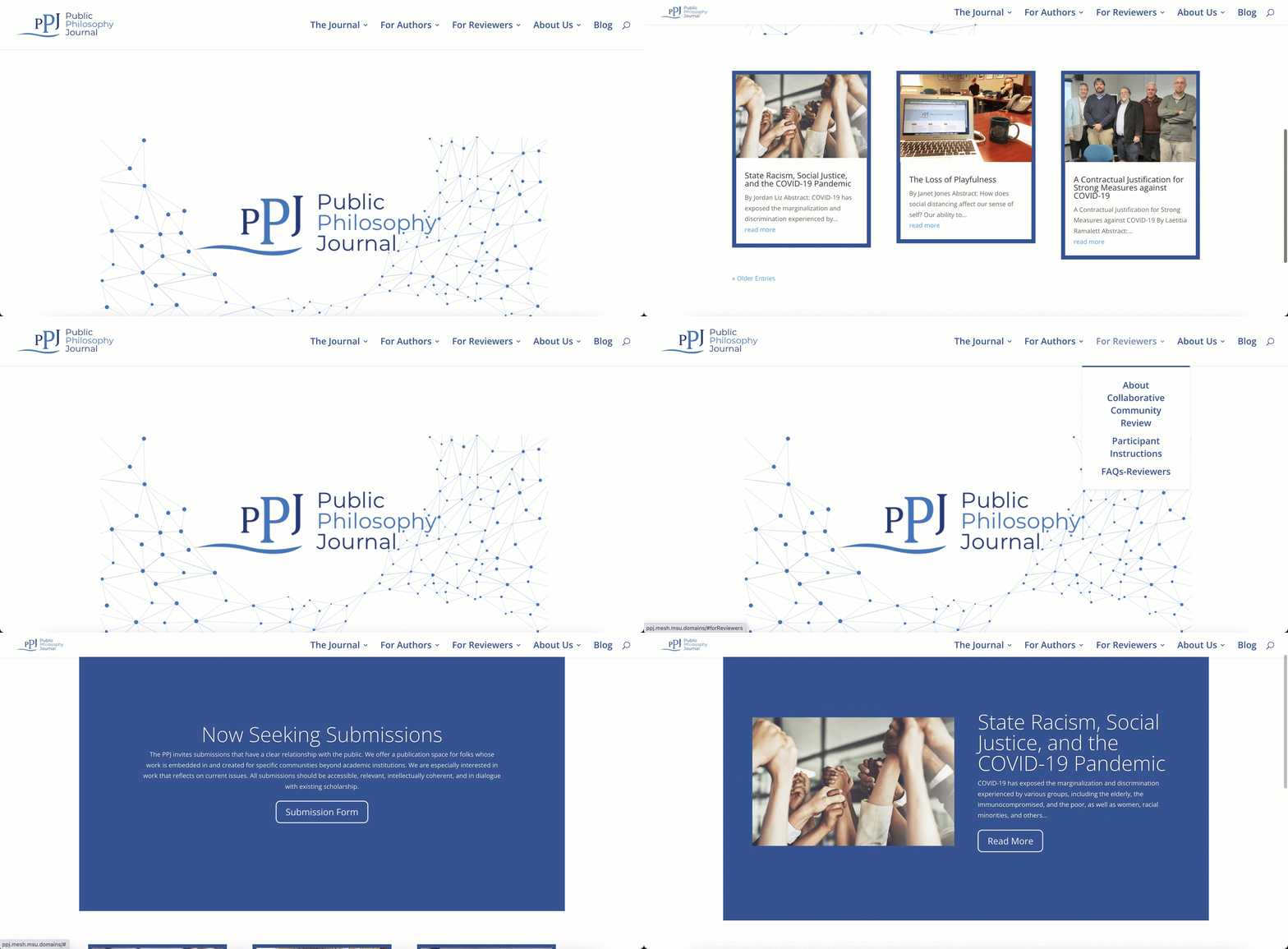
The Homepage
Before:
After:
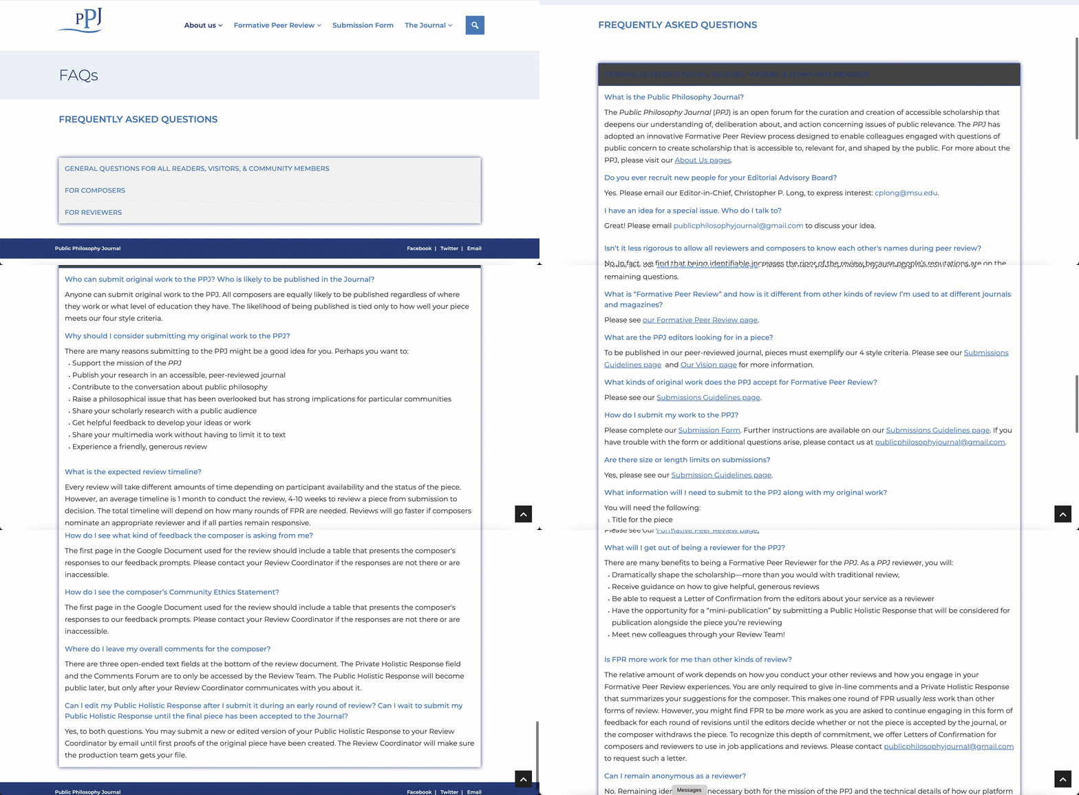
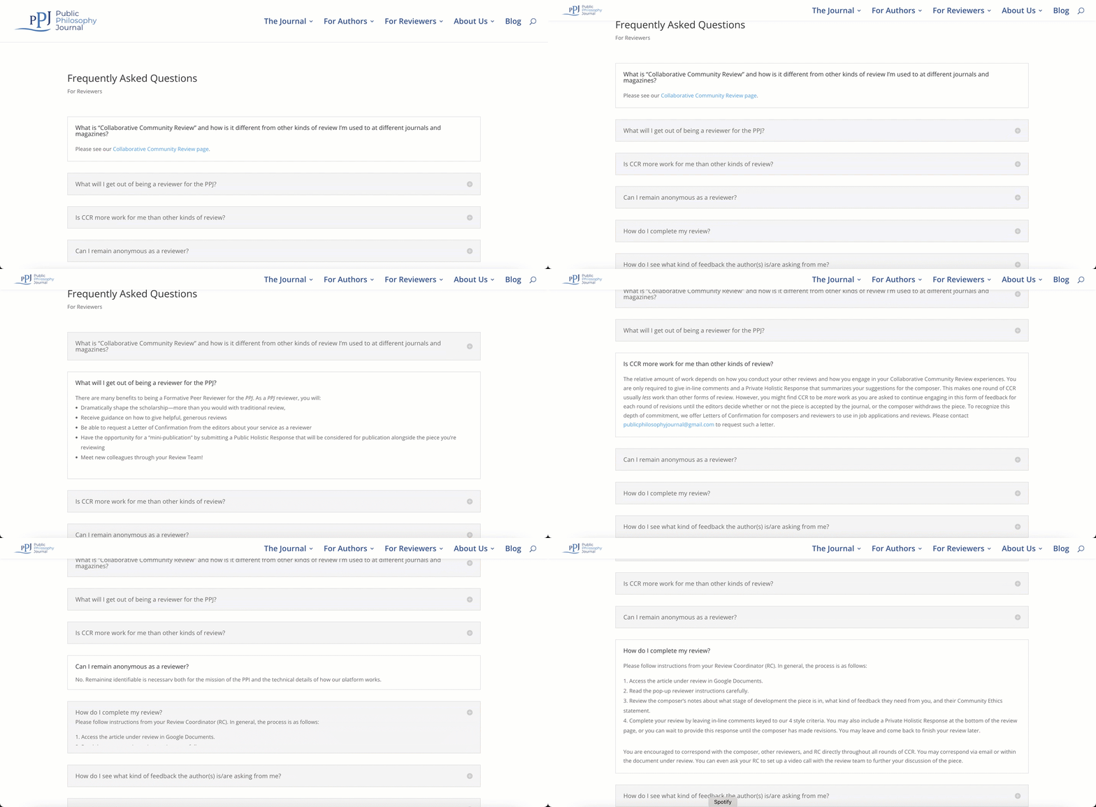
Frequently Asked Questions
Before:
After:
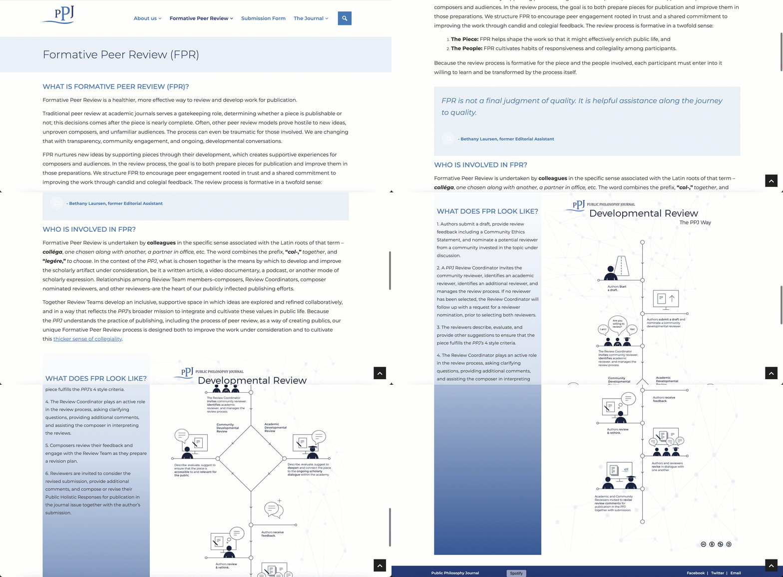
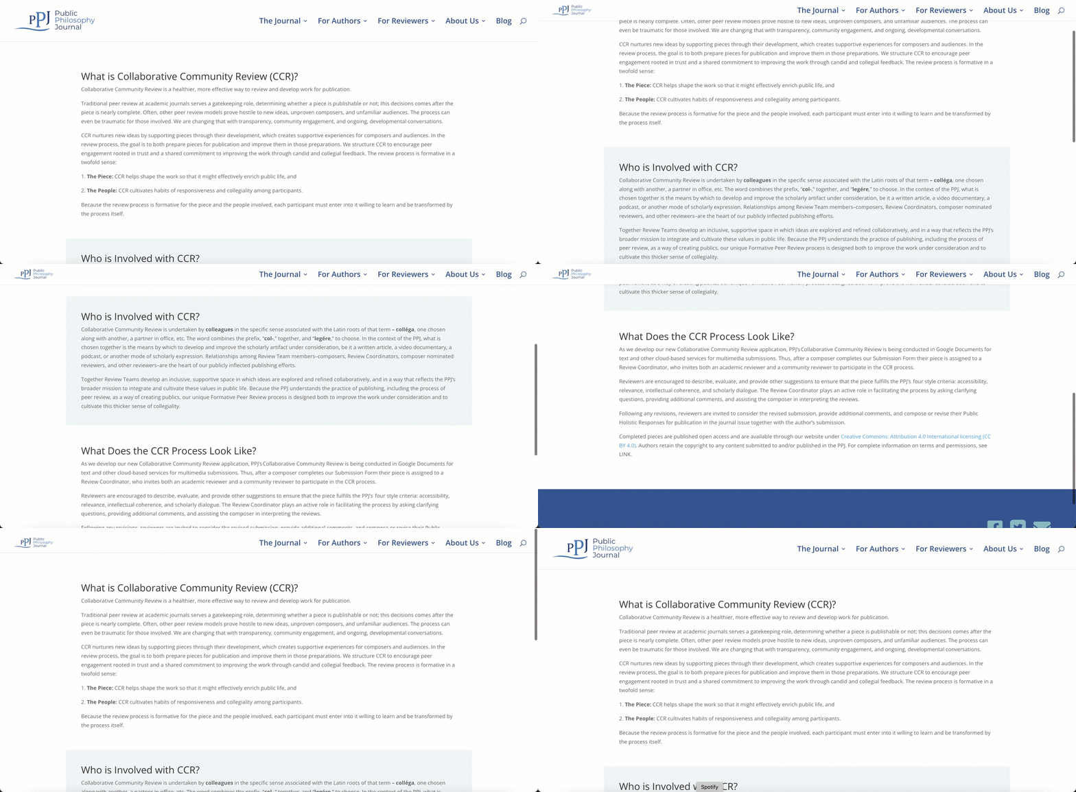
General Page Structure
Before:
After:
Project Learnings
Project Learnings
What I Know Moving Forward:
- User testing deserves a budget. Without incentive, it’s very hard to recruit qualified user groups for testing. This has made it a priority to advocate in the future to define an incentive for those we test to result in better, more consistent user data.
- Branding is hard to change. The identity of PPJ is young, and with the current branding there is a lot of room for growth. It is important to me to respect the ties those have to their work and to help them spread their message and passions within their given bounds.